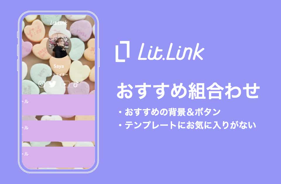
たくさんのテンプレート、たくさんのボタン、たくさんのデザイン背景の中から好きに選ぶことができるのlit.link最大の魅力のひとつです!
…が!
多過ぎて迷ってしまうことも、もちろんありますよね?
そんな時!
ぜひこちらの「ボタンの色」&「デザイン背景」の組み合わせを参考にしてみてはいかがでしょうか?
【色別】
好きな色を一つ選び、同じ様な色で揃える、というのが一番簡単かつおしゃれに見えるやり方です!
saya
違う明るさの一色を使ったコーデとかありますもんね!(๑╹ω╹๑ )
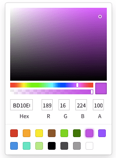
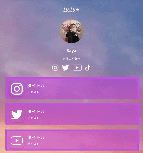
①紫
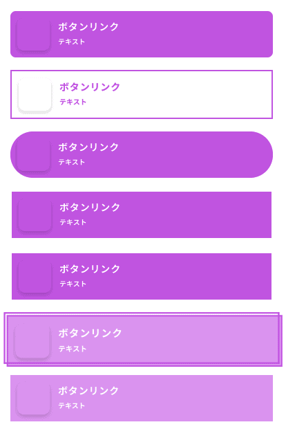
②青

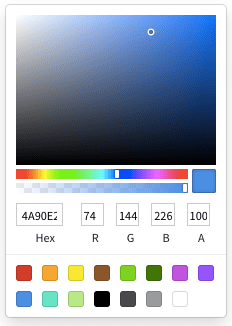
③緑


【背景のテーマに合わせる】
テーマに沿って色を決めてみましょう!
saya
テーマで色を決めるということです!
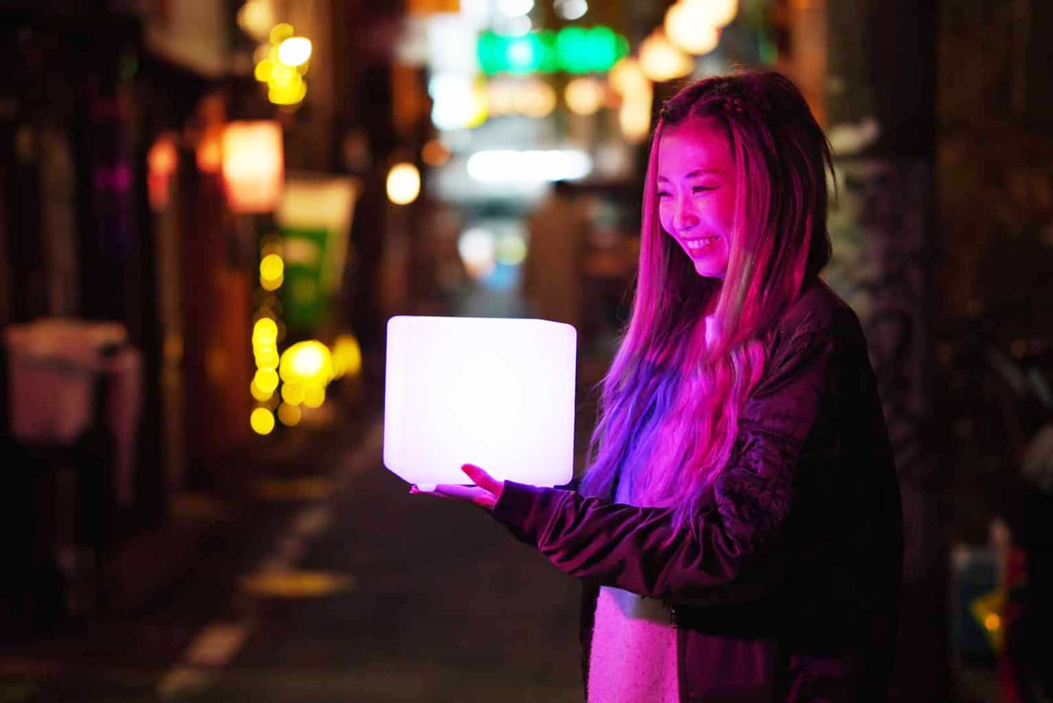
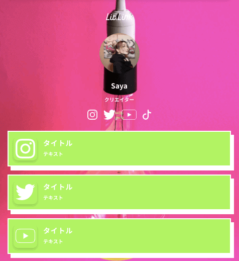
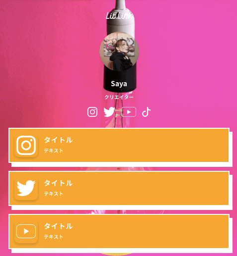
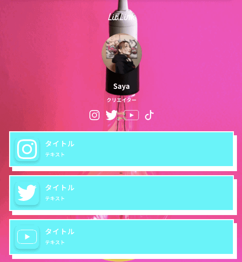
①ネオン
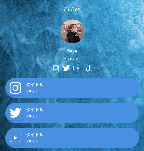
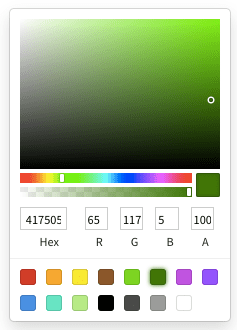
こちらの3種類はボタンの色を買えただけなのですが、こんなにも印象が違います!
背景に使用しているデザインは現職やネオンカラーの多い「Miami Chill」に入っているものなので、ボタンの色を背景と同じピンクにするのではなく、同じタイプのカラーを使用するととてもおしゃれに仕上がります。
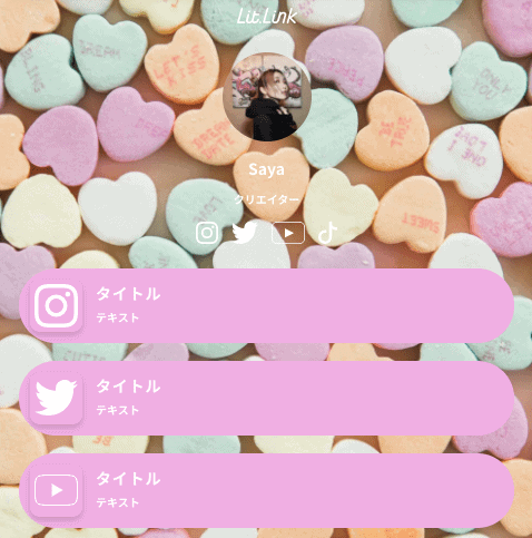
②パステル
続いて「Harajuku Pop」の背景を使用いたしました!
パステル系やかわいい系の多い「Harajuku Pop」にはパステルでボタンを作成するととてもキュートな仕上がりになります!


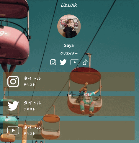
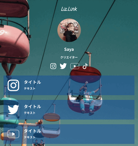
③レトロ
最後に、レトロ感が漂う「Camden Town Retro」からです!
レトロな雰囲気となると、色選び難しいかな…?
と思うかもしれませんが、意外と暗めであればどんな色もあってしまいます!

【まとめ】
今回は何千とも通りがある中からいくつかピックアップをして紹介してみました!
背景xボタンxボタンの色で組み合わせは自由です!
ぜひあなたらしくカスタマイズしてください!


のアイキャッチ画像-min-150x150.png)


公式サイトのアイキャッチ画像-300x150.png)